Boom Dice Pause Button, Take 2
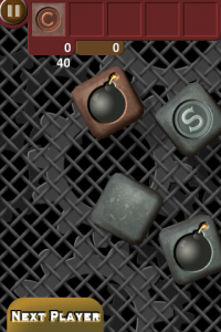
 I blogged about my pause button for Boom Dice earlier and the general necessity of having one. But after looking at it for a while and asking friends about it, I decided to re-design it. The original intent was to make the tabs at the top look like they were coming in on levers and that the pause button was resting on top of that. Unfortunately, it wasn’t very clear that it was a button instead of just some random decoration. So I switched it to a simpler, cleaner design which I actually like better. It just goes to show the importance of testing everything, especially user interfaces.


