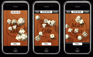
Apparently, there are some issues with transparent navigation bars so I won’t be using those. But I managed to get an opaque navigation bar set up. Here are three versions:
Which do you like best?
- a) the original without any bar
- b) the one with just a bar on top
- c) or the one with both
Doing navigation without a bar (getting it to look back like the original) would be kinda tricky for me because I’d have to write custom code to do all the switching and the other pages (history and settings) look better with the bar since they’ll be more standard iPhone interfaces. So I wanted to get a gauge of people’s opinion as to whether it was worth putting in the effort to do something like that.
Reply in the comments section!


Comments
13 responses to “Navigation Bar”
Hi, I prefer option C, the amount of space lost is minimal and would ensure that all dice are visible.
Oh, and you may have already thought of it, but I’d rather have digits than pips on the d6’s. (Make it optional, tho’, if I used it for Yahtzee, I’d prefer pips.)
I’m gonna say (b). The controls at the top are meaningful and unobtrustive, while heavy black bar at the bottom doesn’t add anything except context for the white button which looks fine floating.
Unobtrusive. Duh.
I think buttons feel better when they are embedded in a surface; a button hovering in midair is strange. Option C.
I think (b) if history and settings are the only new options your going to add, and (c) if you plan on adding other options so you have room to place them on each side of the Rolling button.
I think (b) for the exact reasons Bill Walsh has given. And Alex G. makes sense, too.
I love this app, I have used it frequently, and though I personally have written some very basic code and know how difficult it is to get it working right, I would prefer the just the old look- if that’s impossible, maybe you could reskin the bars so that it is more of an all-in-one thing, and not seperate, like a button and a bar, so it is just 1 sleek bar. Heck, you wouldn’t even NEED to reskin it- just make the button look like the bar.
Option (b), for the reasons Bill Walsh already gave.
I like option B as well. I like the open table look of rather then the boxed in of option C. Option A would be good if the menu was something that was visible from by tapping the die type header.
I prefer option b or option c.
I agree that buttons in midair tend to give a strange feeling to the app.
Additionally on the subject of colors (right?) I would love to be able to have two d20 one color and a third d20 another color.
Case in point with rolling for any d20 based games that have multiple attacks.
I might roll claw – claw – bite as my attack rolls. By having the colors set I can tell the game master which dice is the bite out of the three.
BTW – love the app, it is exactly what I wanted in a dice app – bought it as soon as I saw it.
I’d go for option B, because you have the possibilities for adding navigation in an iPhone way. I think it’s quite difficult to make an intuitive way of navigation without the path bar, as in example A, because all users already know the navigation bar, obviously. I don’t like developers who try to reinvent the wheel with their wacky custom controls, which just don’t work as you expect.
I didn’t went for example C, because it makes the view too narrow. The floating button makes it less claustrophobic, and does not waste that much view space. Option C makes it look like a small miniature screen, and you sigh because your hatred of squinting made you buy an iPhone, and you now seem doomed anyway. Slightly exaggerated, maybe but you catch my drift.
You may consider an other colour for the navigation bar, ‘cos it looks (at least on these pictures) too grey to match to either the iPhone or your app.
I much prefer A. The more table space the better. But if you really want to add bars, I think B is much less intrusive than C. The bar on the bottom just takes up space.
[…] a bit. When you hit the formula bar at the top, task bars (like the one in option C from my “Navigation Bar” post) will show up. When that’s gone, these icons will remain to remind you that you […]