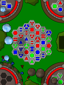
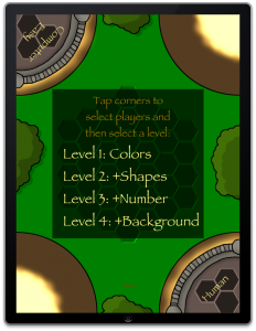
New Art!
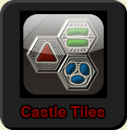
Wednesday, March 31st, 2010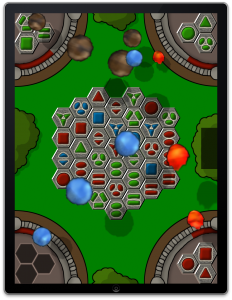 I submitted Castle Tiles for initial review on Saturday and I thought that would be it until the iPad launched. But then I got an email to resubmit with the latest SDK for final review. This actually turned out to be quite fortunate because I got
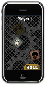
 intense criticism strong encouragement from friends and commentators to completely redo revisit my horrible programmer art initial art pass.
The additional time also gave me some time to review some of my original thinking about the art. For example, I thought that for a puzzle game, the most important priority would be clarity. So choosing pure red, pure green, and pure blue seemed like a logical choice. It turns out that an even higher priority is picking colors that don’t actively assault the eyes with their hideousness are aesthetically pleasing as well.
(For the record, I was originally trying to go for a Keith Haring kind of look but I think the new look works better.)

